You’ve got the invitation. The venue is stunning. The photographer will be there. Now comes the real question: what colour will make you look radiant in every photo?
Choosing the right gown colour for an evening event isn’t just about personal preference. It’s about how that shade interacts with dim lighting, camera flashes, and the overall ambience of the venue. The wrong choice can wash you out or disappear into the background. The right one? You’ll glow in every single frame.
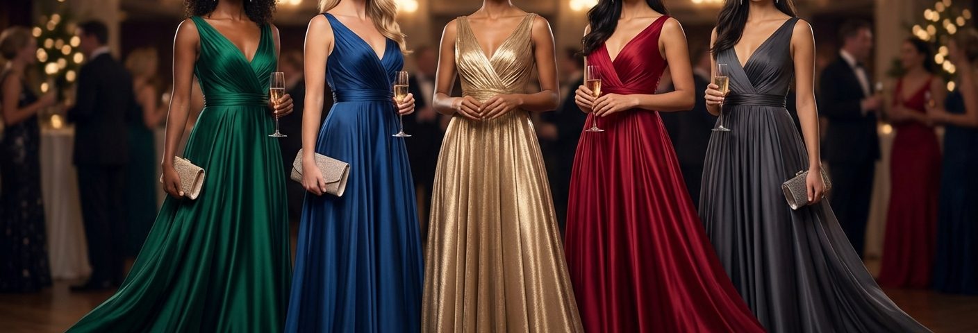
The best gown colors for evening events include jewel tones like emerald and sapphire, rich burgundy, classic navy, and metallics like champagne gold. These shades photograph beautifully under low lighting and camera flash, complement various skin tones, and create stunning contrast against typical gala backdrops. Choose colours that enhance your natural undertones and align with the event’s formality level.
Why Colour Matters More After Sunset
Evening lighting changes everything.
Natural daylight shows true colours. But once the sun sets, artificial lighting takes over. Warm tungsten bulbs, cool LED spotlights, and camera flashes all shift how colours appear. A dress that looks perfect in your bedroom mirror might photograph completely differently at a charity ball.
Certain colours absorb light. Others reflect it. Some create beautiful dimension in photos, while others flatten your features or blend into dark backgrounds.
The venue matters too. Grand ballrooms with chandeliers create different lighting than modern art galleries with track lighting. Singapore’s evening events often feature a mix of both, plus outdoor garden spaces with string lights.
Your skin tone plays a role as well. The same burgundy gown that makes one person look radiant might make another appear tired. Understanding which shades complement your natural undertones makes all the difference.
Five Colours That Photograph Beautifully
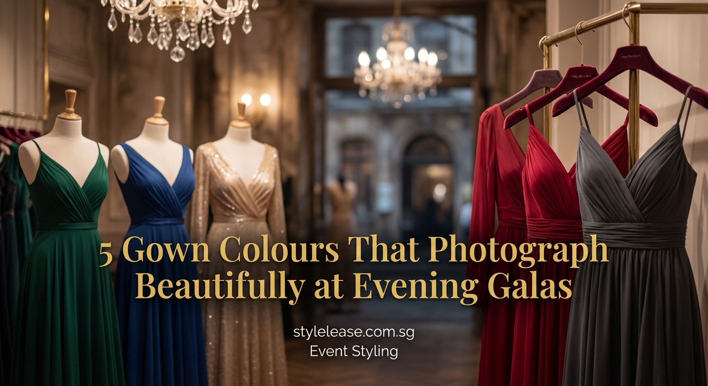
1. Jewel Tones
Emerald green, sapphire blue, and ruby red sit at the top of the list.
These saturated colours hold their richness under artificial lighting. They don’t wash out under camera flash. They create stunning contrast against neutral backgrounds and other guests wearing black.
Emerald green particularly shines at evening events. It photographs with incredible depth and complements both warm and cool skin tones. The colour looks expensive on camera and stands out without screaming for attention.
Sapphire blue offers similar benefits. It’s formal enough for black-tie galas but feels fresh and modern. The shade photographs with beautiful dimension, showing folds and draping in the fabric.
2. Deep Burgundy and Wine Tones
Burgundy has become a favourite for Singapore evening events.
The colour combines the drama of red with the sophistication of purple. It photographs gorgeously under warm lighting and looks stunning against gold or silver accessories. Burgundy flatters most skin tones and feels appropriate for both corporate galas and charity fundraisers.
Wine tones also work beautifully in photos. They’re rich enough to hold visual weight but subtle enough to feel elegant rather than attention-seeking. These shades complement the warm lighting common in hotel ballrooms.
3. Classic Navy
Navy deserves more credit as an evening colour.
It photographs almost as well as black but offers more visual interest. Navy shows texture and draping better than black, which can sometimes appear flat in photos. The colour works across seasons and feels appropriate for every formality level.
Navy also solves a common problem: it won’t blend into dark backgrounds the way black sometimes does. Your silhouette stays defined in group photos and venue shots.
4. Metallics
Gold, champagne, and rose gold create magic under evening lights.
Metallic fabrics catch and reflect light beautifully. They photograph with gorgeous dimension and create a subtle glow around your face. These colours feel celebratory without being overly flashy.
Champagne gold particularly suits Singapore’s evening events. It’s elegant, timeless, and complements the warm lighting in most venues. The colour also photographs well next to other popular gown shades, making it perfect for group photos.
Silver and gunmetal metallics work too, especially for modern venues with cooler lighting. They create a sophisticated, contemporary look that photographs beautifully.
5. Rich Emerald and Forest Green
Green has emerged as a top choice for evening photography.
Deep green tones photograph with incredible saturation and depth. They stand out in a sea of black gowns and create beautiful contrast in photos. The colour also complements the lush garden settings common at Singapore events.
Forest green works particularly well for outdoor evening portions of events. It photographs beautifully against natural elements while still feeling formal and elegant.
Matching Colours to Your Skin Tone
Understanding your undertones helps narrow down the best options.
Warm undertones (golden, peachy, or yellow-based skin):
– Burgundy and wine tones
– Champagne gold and warm metallics
– Emerald green
– Warm reds with orange undertones
Cool undertones (pink, red, or blue-based skin):
– Sapphire and royal blue
– True red and ruby tones
– Silver and platinum metallics
– Jewel-toned purples
Neutral undertones (a mix of warm and cool):
– Navy
– Forest green
– Rose gold
– Most jewel tones
You can test this at home. Hold different coloured fabrics near your face in natural light. The right undertones will make your skin look brighter and more even. The wrong ones will make you appear washed out or sallow.
Colours to Approach With Caution
Some shades present challenges under evening lighting.
Pastels often disappear in low light. Pale pink, baby blue, and mint green can wash out completely under dim chandeliers. They also tend to overexpose in flash photography, losing all detail and dimension.
Very light colours face similar issues. Ivory and cream can photograph as pure white, losing all texture. They also show every shadow and can make you appear larger in photos.
Neon and extremely bright colours can overpower everything else in a photo. Hot pink and electric blue might look fun in person but often photograph harshly, especially under flash.
All-black can sometimes flatten in photos, though it remains a safe choice. If you choose black, look for textures like velvet or lace that create visual interest.
How Lighting Affects Your Colour Choice
Different venues create different challenges.
Hotel ballrooms typically use warm tungsten lighting. This makes warm colours like burgundy and gold look incredible. Cool colours can appear slightly muted but still photograph well.
Modern galleries often use cooler LED lighting. This favours jewel tones and metallics. Cool blues and greens photograph particularly well in these spaces.
Outdoor garden spaces rely on string lights or lanterns. These create warm, flattering light that suits most colours. Metallics particularly shine in these settings.
Mixed lighting venues (common in Singapore) present the biggest challenge. Stick with jewel tones or navy, which photograph consistently across different light sources.
Practical Steps to Choose Your Colour
- Check the venue photos from previous events to see the lighting setup
- Consider the season and time of year (lighter metallics for warmer months, deeper tones for cooler periods)
- Look at your wardrobe and identify which colours you receive the most compliments wearing
- Test potential colours by taking photos in similar lighting to the event
- Consider what other guests might wear and choose something that stands out appropriately
- Factor in your accessories and whether you already own jewellery that complements certain colours
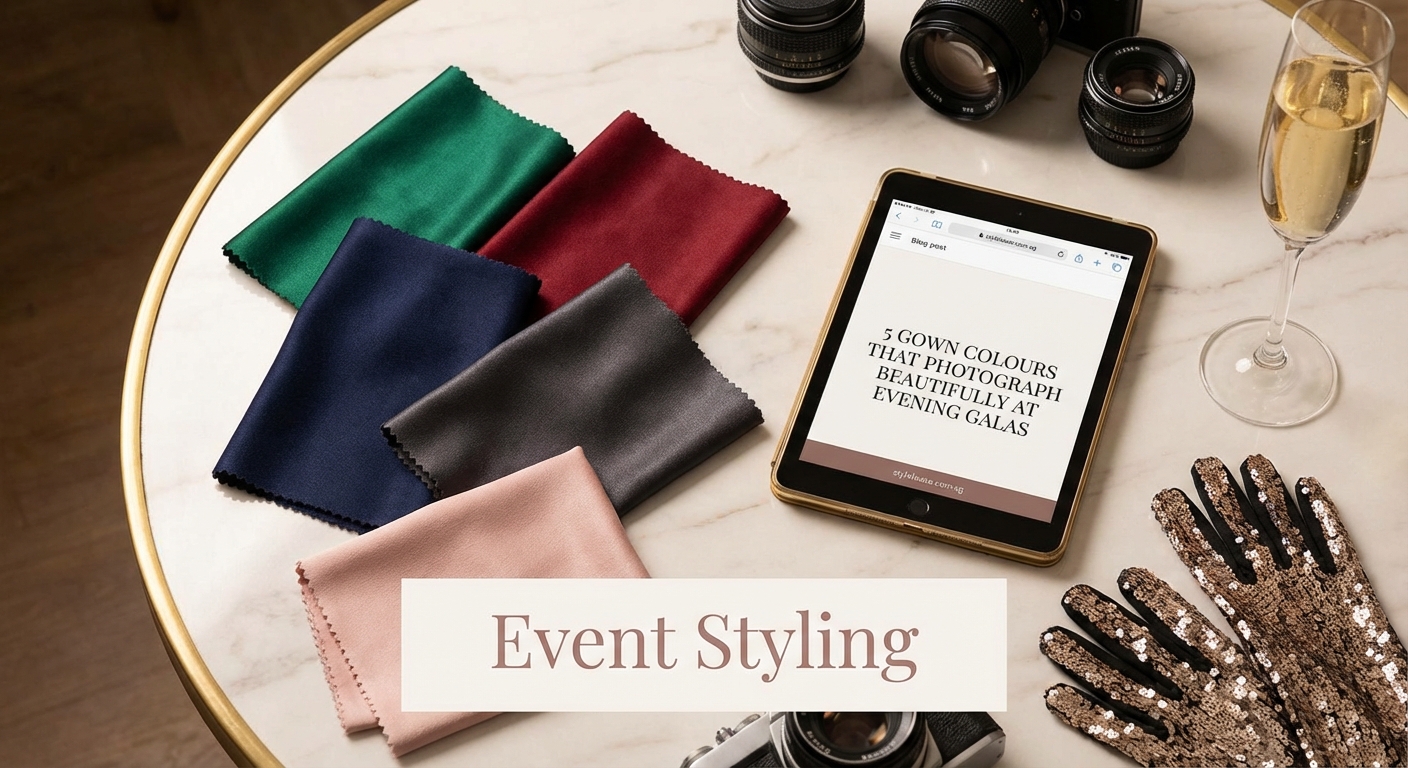
The Role of Fabric in How Colours Photograph
Fabric choice affects how your colour appears on camera.
Velvet creates rich, deep tones that photograph with beautiful dimension. The fabric catches light gorgeously and adds visual weight to any colour. Burgundy velvet and emerald velvet are particularly stunning in evening photos.
Satin and silk create a subtle sheen that enhances metallics and jewel tones. These fabrics reflect light beautifully without looking overly shiny in photos.
Sequins and beading add sparkle but can sometimes overpower in flash photography. If you choose a heavily embellished gown, consider a slightly deeper colour to balance the brightness.
Matte fabrics like crepe photograph cleanly and show true colour. They’re excellent choices if you want your colour to appear exactly as it does in person.
“The best gown colour is one that makes you feel confident and photographs in a way that represents how you actually look. Don’t chase trends if they don’t suit your colouring. A well-chosen shade that complements your skin tone will always outperform a trendy colour that washes you out.” — Professional event photographer
Colour Combinations and Styling
Your accessories should complement, not compete.
| Gown Colour | Best Metal | Complementary Accent |
|---|---|---|
| Emerald green | Gold or rose gold | Warm-toned gemstones |
| Sapphire blue | Silver or white gold | Diamonds or clear crystals |
| Burgundy | Gold or bronze | Deep red or purple stones |
| Navy | Silver or platinum | Sapphires or pearls |
| Champagne gold | Rose gold or yellow gold | Minimal, let dress shine |
Keep makeup in mind too. Jewel-toned gowns pair beautifully with neutral makeup that lets the dress be the statement. Metallics allow for slightly bolder lip colours.
If you’re attending multiple events throughout the year, similar to what to wear to a Singapore wedding, building a small collection of gowns in different colours gives you flexibility while ensuring you always have a photogenic option.
Common Colour Mistakes to Avoid
Matching the venue too closely. If the event has a gold and cream colour scheme, wearing champagne gold might make you blend into the decor. Choose a complementary colour instead.
Ignoring the dress code. Some corporate galas prefer conservative colours like navy or burgundy over bright jewel tones. Check the invitation for guidance.
Choosing colour over fit. A perfectly fitted gown in a less-than-ideal colour will always photograph better than a poorly fitted gown in the perfect shade.
Forgetting about colour transfer. Very saturated colours can sometimes reflect onto your skin in photos, creating an unwanted colour cast. This is rare but worth considering with extremely bright shades.
Seasonal Considerations for Singapore Events
Singapore’s climate stays relatively consistent, but event seasons vary.
Charity galas often happen in the cooler months (November through February). Deeper colours like burgundy and forest green feel appropriate for this period.
Corporate award ceremonies occur year-round. Navy and jewel tones work for any season and photograph consistently.
Outdoor evening events favour colours that won’t show humidity or heat. Darker jewel tones and navy hide any concerns better than light colours.
Making the Most of Your Colour Choice
Once you’ve selected your colour, maximize its impact:
- Have your gown steamed or pressed before the event so the colour appears crisp and saturated
- Test your makeup and accessories together in similar lighting to the venue
- Take test photos with your phone to see how everything photographs together
- Consider the background where photos will likely be taken
- Bring a wrap or shawl in a complementary colour for outdoor portions
Renting Versus Buying for Colour Variety
Renting gowns gives you access to a wider colour range without the commitment.
You can try jewel tones for one event and metallics for the next. You’re not limited to one or two colours in your wardrobe. This flexibility lets you choose the absolute best colour for each specific event, venue, and season.
Renting also means you can wear trending colours without worrying about them dating quickly. That emerald green that’s perfect for this year’s gala season might feel tired next year. Renting lets you stay current.
The environmental benefits matter too. Sharing gowns reduces waste and the resources needed to produce new garments. You get variety while making a more sustainable choice.
Your Perfect Colour Awaits
The best gown colors for evening events combine photogenic qualities with personal style. Jewel tones, rich burgundy, classic navy, and metallics consistently deliver stunning results across different venues and lighting conditions.
Start with your skin tone. Test colours in similar lighting to your event. Consider the venue and season. Then choose the shade that makes you feel most confident.
The right colour will do more than photograph well. It’ll make you stand out for the right reasons, complement your features, and ensure you love looking back at photos for years to come. That’s worth taking the time to get right.